CASE STUDIES
I have a mantra. It drives me and goes like this:
"Keep it fun. Keep it real. Keep it going."
This is my sustainable method in a nutshell, and the following case studies are intended to give you a taste of how I think and make.


> CASE STUDY 1 | IDENTITY SYSTEM
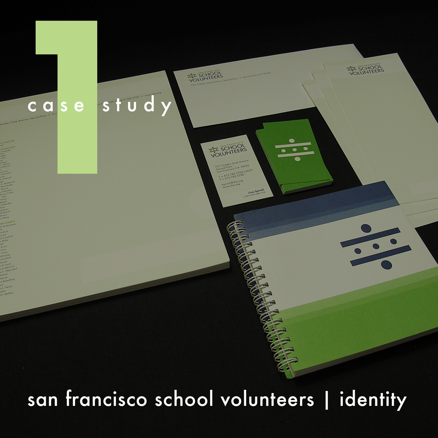
San Francisco School Volunteers
At the time of this project, San Francisco School Volunteers (SFSV) was the largest source of volunteers for San Francisco public schools. Each year they recruited and trained more than 1,400 volunteers and place them in a diversity of roles in schools across the district. Established in 1963, SFSV’s singular focus on serving the public schools has made it an integral part of the city’s education system. Teachers overwhelmingly agreed that SFSV volunteers played a vital role in students’ success. 96% of teachers who were surveyed agreed that SFSV volunteers enhanced their teaching and students not only increased in academic skills but in self-esteem and confidence.
PROBLEM: New Executive Director, Lisa Spinali, aimed to create a fresh, clean mark and take a 43 year-old organization and make it innovative. Concerns about the then current logo: does not print or reproduce well; not clean and crisp; cannot “plug and play” with it; cannot tell what it is. In three years time SFSV would be: an incredible, powerful organization of community mobilization leveraging resources to get the help and support the schools need. They would be a catalyst for improving the education of the SF public school system. (How could the new mark help to deliver on this vision?)
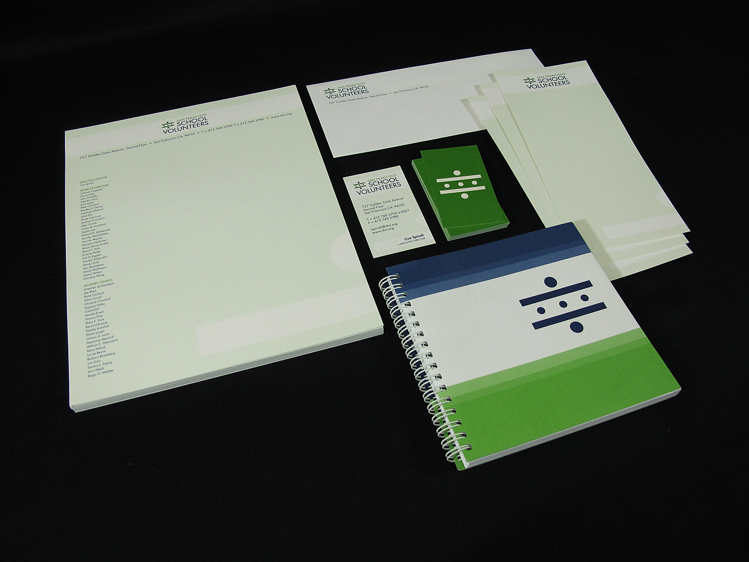
SOLUTION: The new mark system looks to show connection and collaboration in a bold and efficient manner, and convey authority and competence. The logotype strongly communicates that the organization is in the business of building a volunteer network in a school setting; it also leaves an opportunity to tailor the geographic designation should the organization follow a growth track that applies the SFSV model elsewhere as a franchise. Deliverables were: presentation on findings in the discovery phase, logo/logotype, business cards, letterhead, Nº 10 envelope, notecards, mailing labels, graphic standards/style guide.
CHALLENGE(S): Strategically, the mark would: communicate that they are movers & shakers, that they care about kids and their quality of education, and that SFSV is making things happen; need to be inclusive of older children—not juvenile; show community/school has greater importance/weight as compared to the concept of “volunteers”; have entrepreneurial spirit; be sophisticated and appeal to all—but should not be overly affluent or fancy. Graphically, it would: need to be bold and clean and universal; use contrasting colors—NO PASTELS! NO YELLOW! One major consideration: skillful leadership and organizational change management was required to facilitate adoption of the new branding by long-term stakeholders. Another was about the naming—SFSV? All spelled out? What does the brand equity suggest about that? Does it allow for potential scaling in other cities?
RESULTS: Taking this pro bono service project on with Taproot Foundation made sense as the process approach to logo development and branding seemed to be pretty well matched. The discovery phase produced key insights based on historical background, informational interviews over a broad mix of constituencies, focus groups, perceptions and attitudes, and a competitive audit. Program value statements and quotes were recorded to help paint the current picture. Pain points about the branding included inconsistency, passive marketing, forgettable, unclear messaging, busy, unprofessional. Core brand attributes to inform the mark were identified as: welcoming; committed; visionary; strategic; collaborative; inspirational; supportive; active in community. Exercises on positioning, value proposition, key messaging, and naming implications were finalized. Goal setting and visioning with the future brand helped pave the road toward implementation. I took all the brand and marketing intel from these engagements to move to concept generation—I imagined both literal and abstract. I collected various forms of visual research for inspiration. The sketches that emerged provided options to develop into initial rough symbols. After some internal team discernment, 8 concepts were presented to the client. In my view, logos must work first in black only. 3 semifinalist concepts were developed further before 1 was picked as the final direction. Type studies, then color studies were the next stages of development. A very happy client looked forward to seeing the new mark expressed fully in their future branding and marketing efforts.
PERSONAL ROLE(S): graphic design, print management
THE STORY: The new brand mark was conceptually inspired by a crosswalk and graphically represents the relationship between teacher and volunteer (larger dots) and the students they help (smaller dots). The bars of the crosswalk function as the outstretched arms of the adults, symbolizing protection of their investment, as well as care and commitment to school-age children and their quality of education. Additionally, the crosswalk itself can be perceived as an equal sign, communicating equality, diversity, and balance in education; leveling the playing field of learning for the students where there is obvious discrepancy; demonstrating that amount of responsibility and rewards of teacher and volunteer are virtually the same. Other SFSV brand attributes as represented by the center dots include: movement and safe passage into the future; advancement and cultivation of ideas and vision; enhancement of the communities to which these students belong.

> CASE STUDY 2 | BRANDING
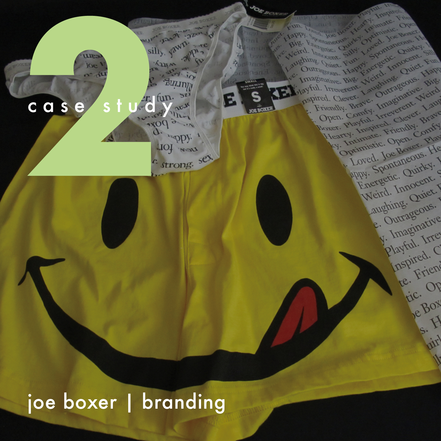
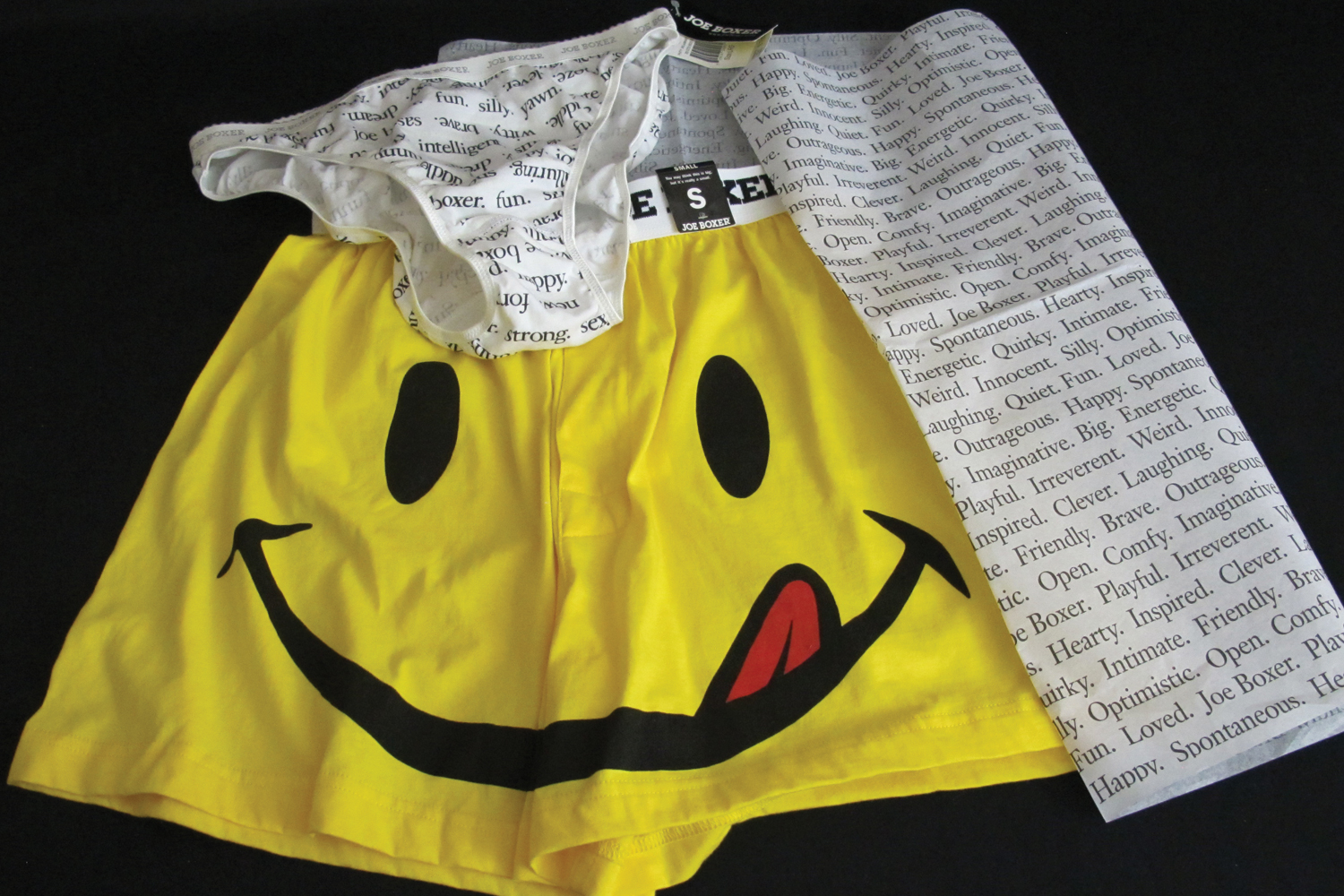
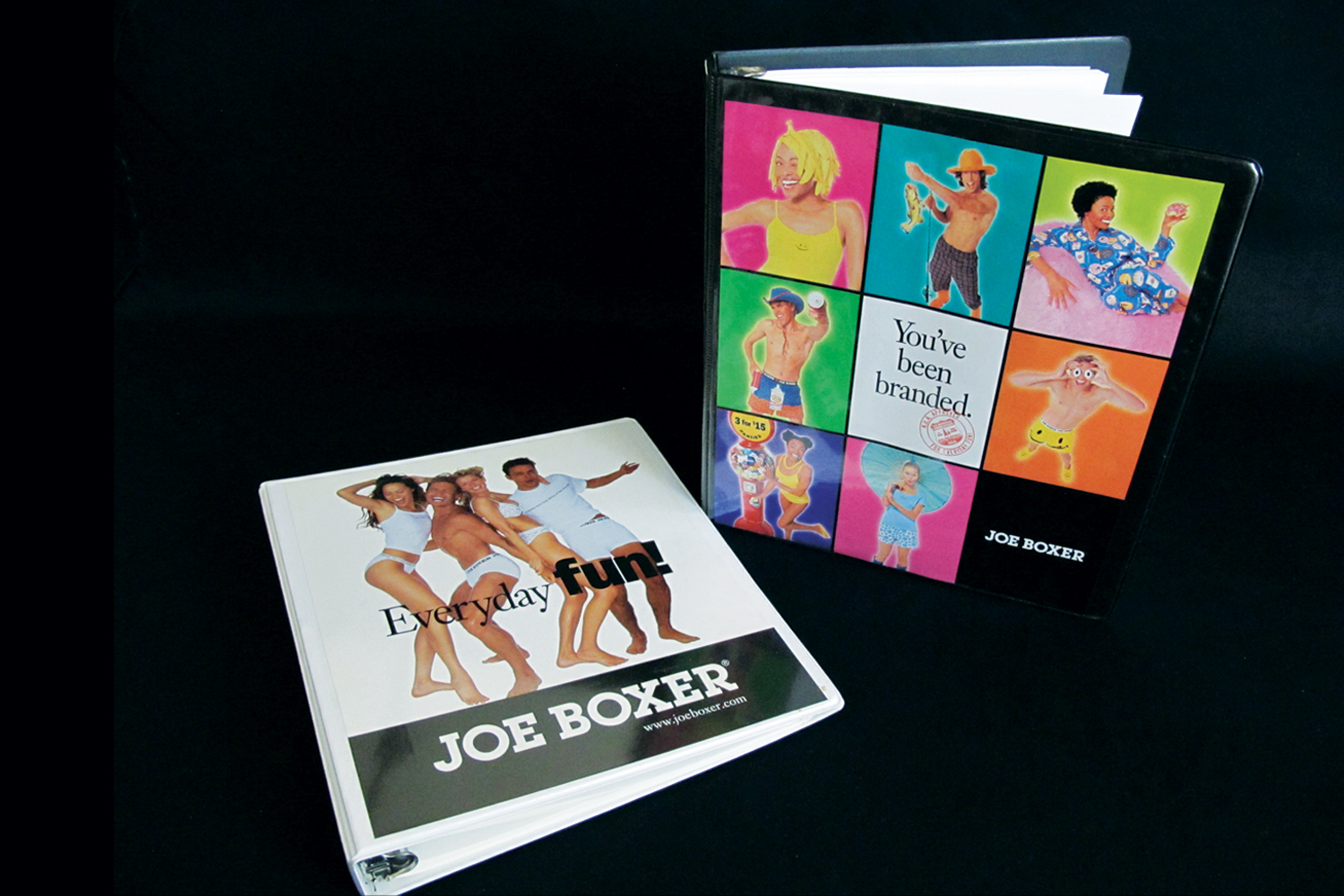
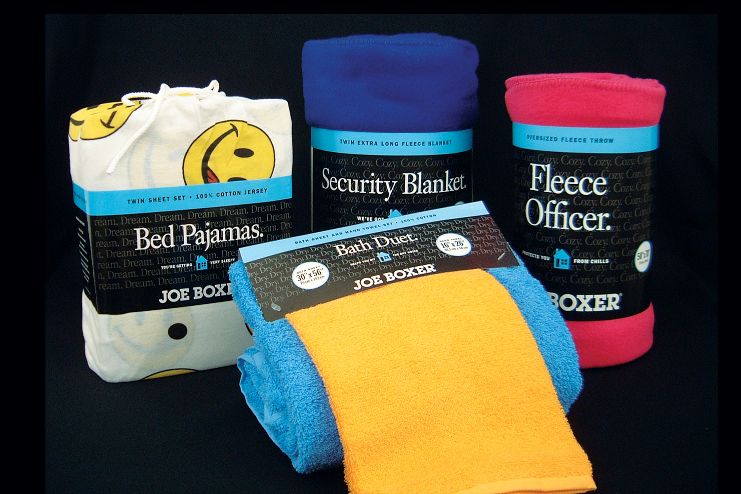
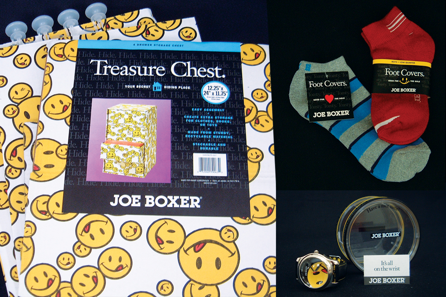
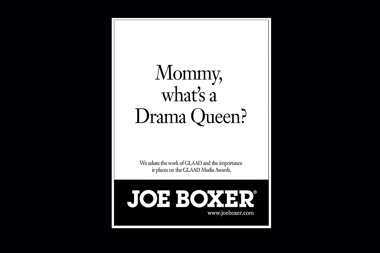
Joe Boxer
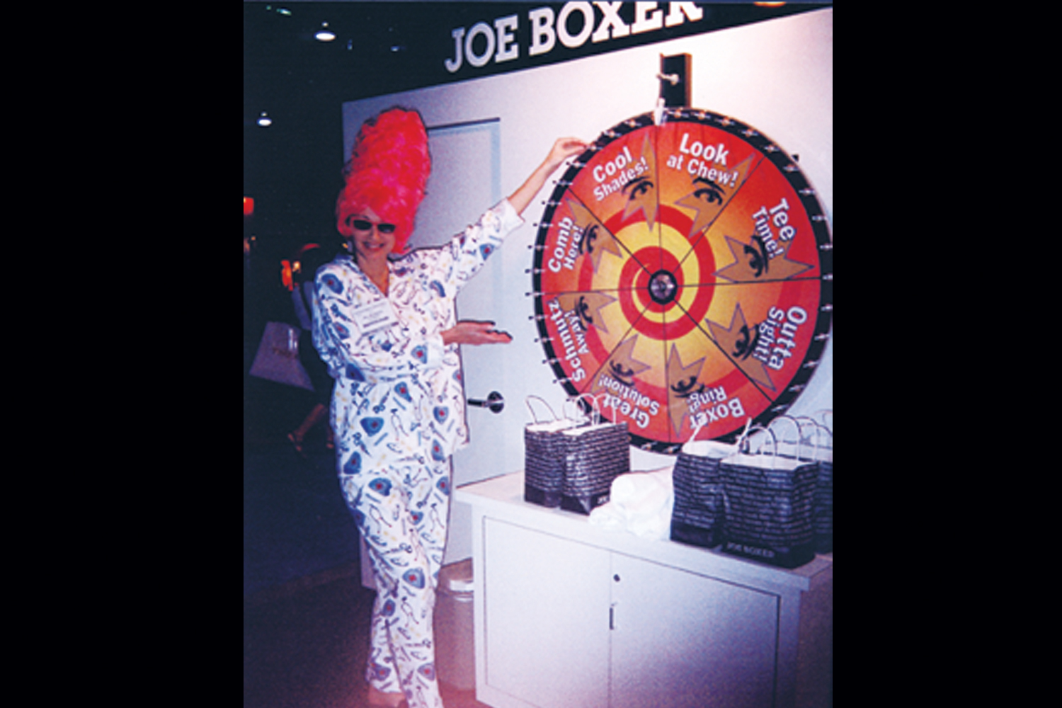
Joe Boxer began as a very simple idea: What would happen if the most basic element of men's clothing was remade to reflect humor, fashion and popular trends in American culture? The ensuing years of the company saw incredible growth and expansion into a lifestyle brand that spoke to all genders and ages. What started as ties sold as Macy's ended up becoming a household name. At one point, Joe Boxer had 77% brand recognition, which opened doors for opportunities for marketing partnerships with brands such as Virgin Atlantic, General Mills, Warner Bros., and General Motors. Nick Graham's tagline, "The brand is the amusement park. The product is the souvenir." was the process by which we created a memorable user experiences from a small item like Chiclets (we called "Chew Toy") to a huge event like a over-the-top fashion show in Reykjavik.
PROBLEM: The consumer products sector needed constant attention. New and improved this; remember the good ol' days that. While the Joe Boxer track record of pleasant oddities was cause for admiration, innovating on these laurels made for a non-stop ride. The company needed to monitor market and fashion trends, yet be true to itself while it continuously produced its unique offerings as it expanded its line of products.
SOLUTION: Consistent with the "credo" (list of values like: Fun, Inspired, Weird, Irreverent), all products and activities as a collection embodied the qualities listed.
CHALLENGE(S): The whimsical nature of the brand, the brainchild of which was conceived by Nick Graham, was like a moving target. I loved that guy's energy. Nick surrounded himself with people who could execute and commercialize very outrageous ideas. In a sense, you survived as an employee (or licensee) by living the brand, anticipating the WAY out-of-the-box thinking that was required for success. Later on, a switch to new ownership for the opportunity for scaling in KMart stores required slight cultural adjustments closer to mainstream appeal.
RESULTS: Expansion of the brand into a mainstream big box achieved a greater distribution through which the products could delight even more people. Extension of apparel and home categories saw revenues double to $200M in the first month of launch. Strict controls were still necessary to maintain brand essence and maximize adherence to foundational values. But playing was the name of the game, and was perfect for an adult kid such as myself. On top of the normal things a design studio would do, our brand communications and product design teams (I was a contributor in both) met frequently to discuss trends and various moods that would inform our work. Our robust peer review ensured high-level brand consistency. We'd look at what other people were doing (or going to do) and not do that. The holy grail was to get a reaction. Our packaging, hangtags, and signage was bold and distinctive, always showing fun freedom. Naming was an important component to our offerings so our team took extensive methods to generate hundreds of options, along with creative instructional copy, for all of our SKUs. A staff colleague paid me the highest compliment when I was trusted to "Joe Boxerize" things... I didn't know that was a verb. The design and brand departments worked well in concert to support cutting-edge marketing efforts and events, clever merchandising, and our earned brand recognition was the reward for our good process.
PERSONAL ROLE(S): naming, copywriting/editing, graphic design, packaging, brand management, textile design, photo shoot production

> CASE STUDY 3 | COLLATERAL
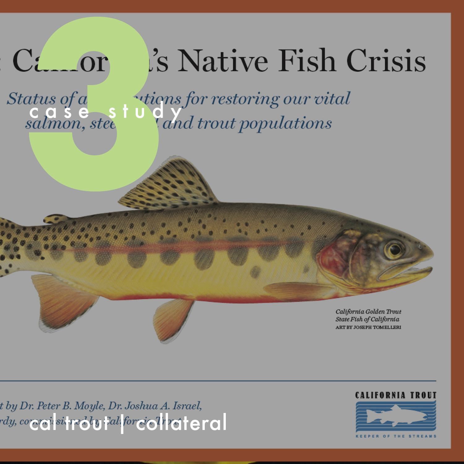
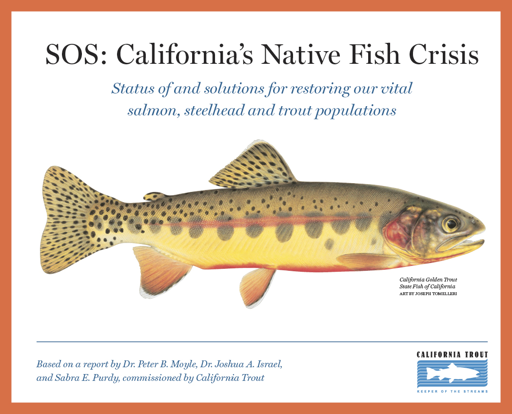
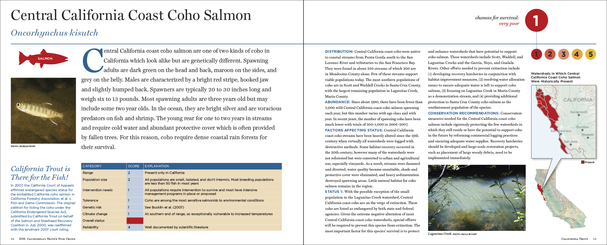
California Trout
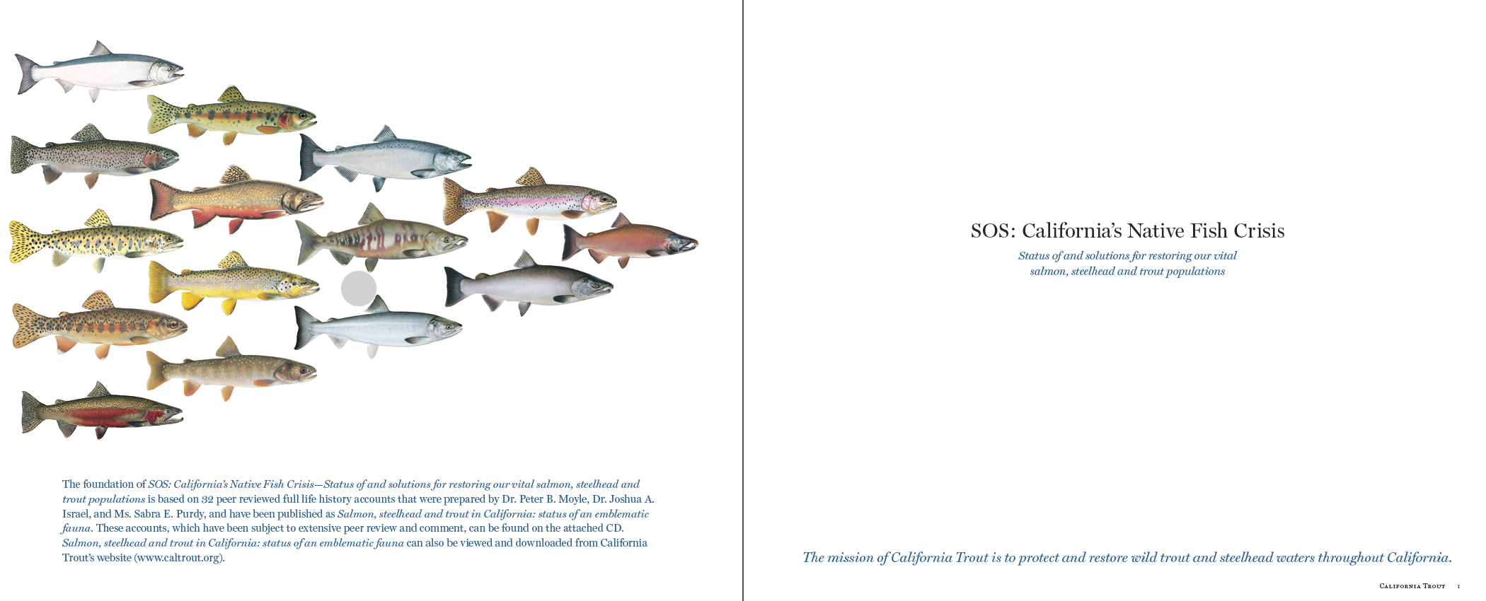
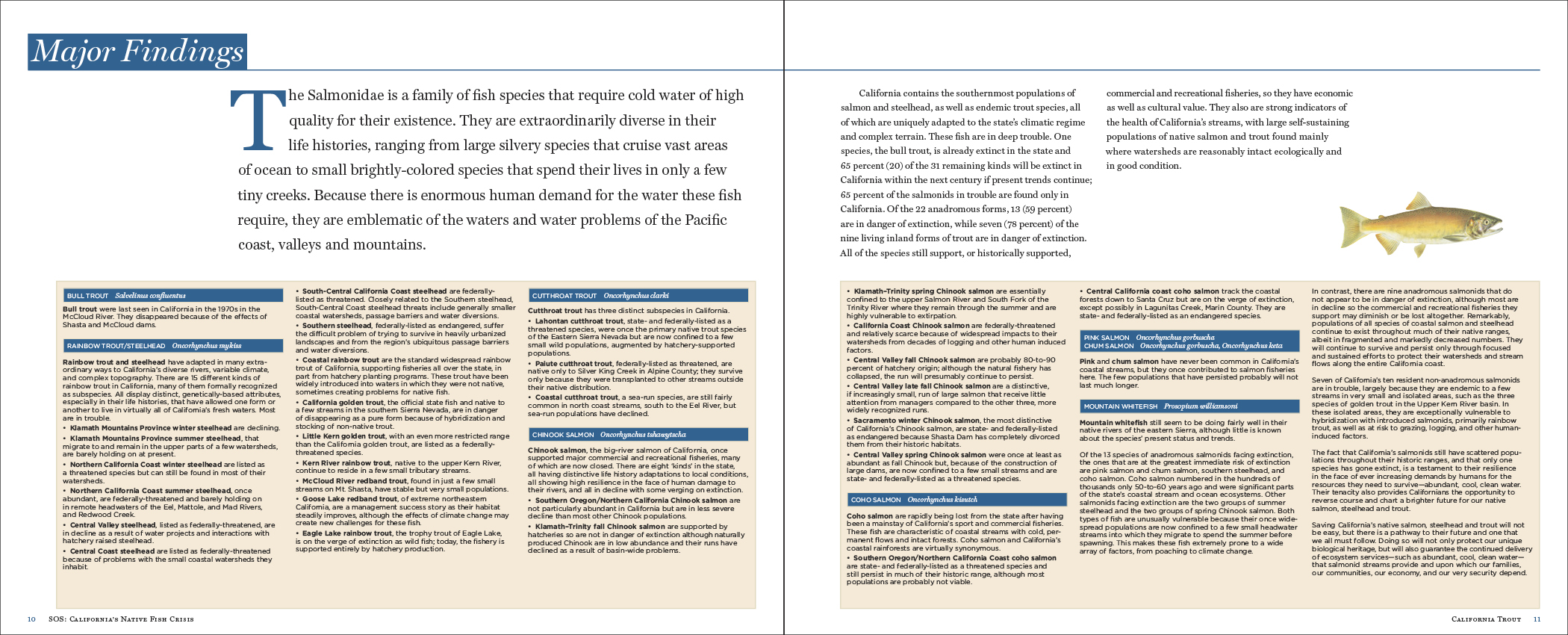
Diversity of California salmon and trout species is among the highest nationally, thanks to the state’s scale, expansiveness and wide range of habitats. California also contains the southernmost runs of salmon and steelhead, which are adapted to the highly variable nature of the state’s climate. From the Sierra Nevada to the Central Valley, to the coastal plains and old growth forests, these fish are part of an amazing natural heritage.
PROBLEM: The bull trout is already extinct in the California, and 65 percent (20) of the 31 remaining species may become extinct in the state within the next century if present trends continued. Our native salmonids are in steep decline because of increased competition with humans for resources, primarily water. Climate change is also exacerbating the problem because it will ultimately reduce the amount of cold water habitats that our salmonids require.
SOLUTION: This field guide provides the status and solutions for restoring salmonid populations in California. It is a multifunctional resource for scientists, policymakers, consumers, and just about any other stakeholder that depends on the vitality of these species (including us). It offers facts and figures relating to each of the species, awareness of the human/animal activities and policies that contributed to the problem in the first place, and provides context through which we can act appropriately.
CHALLENGE(S): The intent was not to be exhaustive with information, but to present short and poignant cases that distill knowledge brought forth from the scientific community (Peter Moyle & UC Davis research team). Portability and modular attributes contribute to it being a reliable and valuable quick resource.
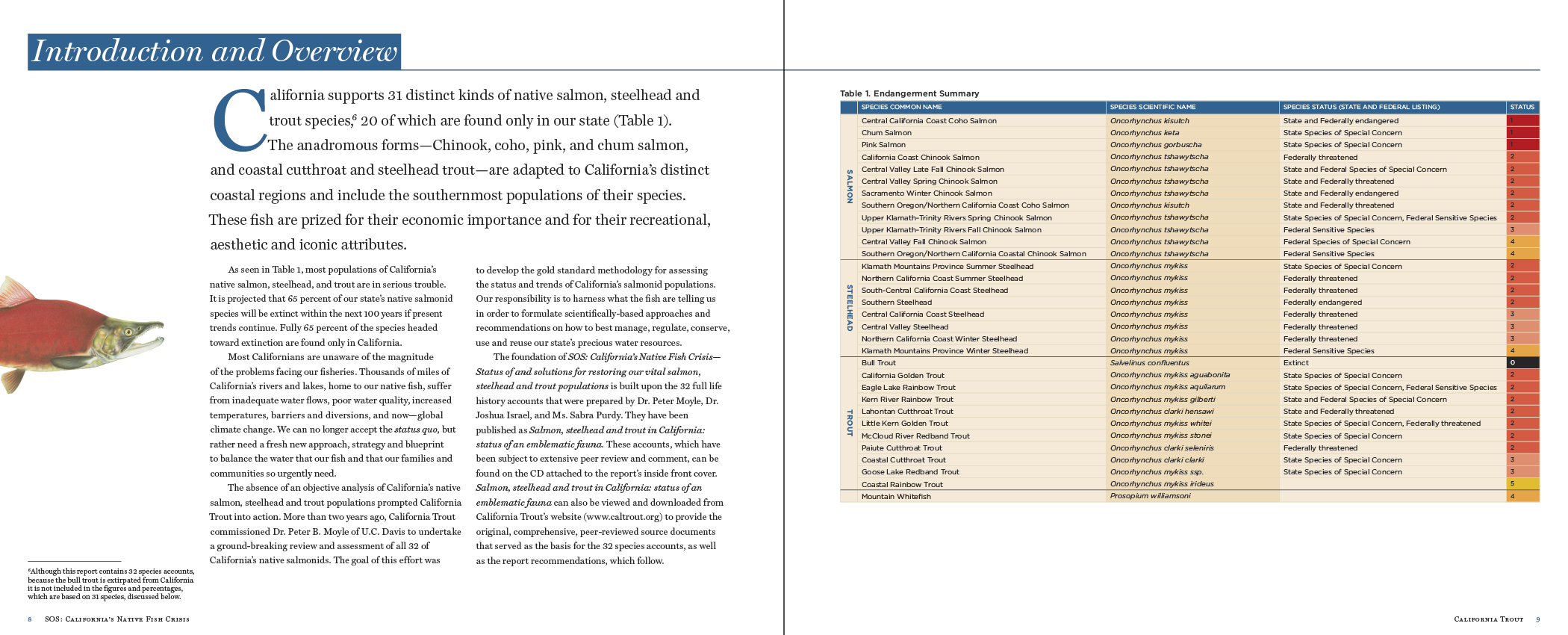
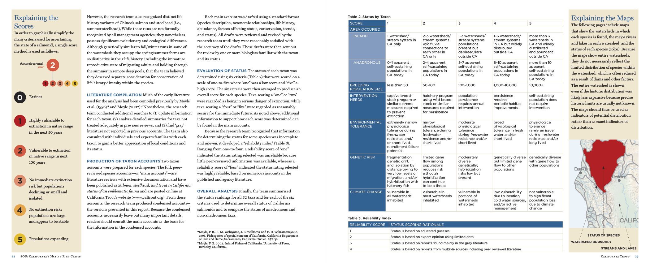
RESULTS: In addition to setting the stage with historical background and intent to create impact, the main focus of this publication was about the accounts or snapshots for each of the endangered species. The methods of research culminated in these major reporting elements in the graphical layout: color-coded single score to express overall vulnerability 0 (extinct) to 5 (populations expanding); status criteria by taxon (area, breeding population, environmental tolerance, genetic risk, climate change and research reliability; general watershed in which the species is threatened. While it is uncertain the actual change in status of any species as a direct result of this field guide, one related example of work underway to improve salmon spawning habitat is by The Nature Conservancy at the Nelson Ranch & Big Springs Creek areas in Sisquiyou County (friends Ada Fowler and Chris Babcock are involved).
PERSONAL ROLE(S): cover and internal design and layout
> CASE STUDY 4 | SOCIAL CAMPAIGN
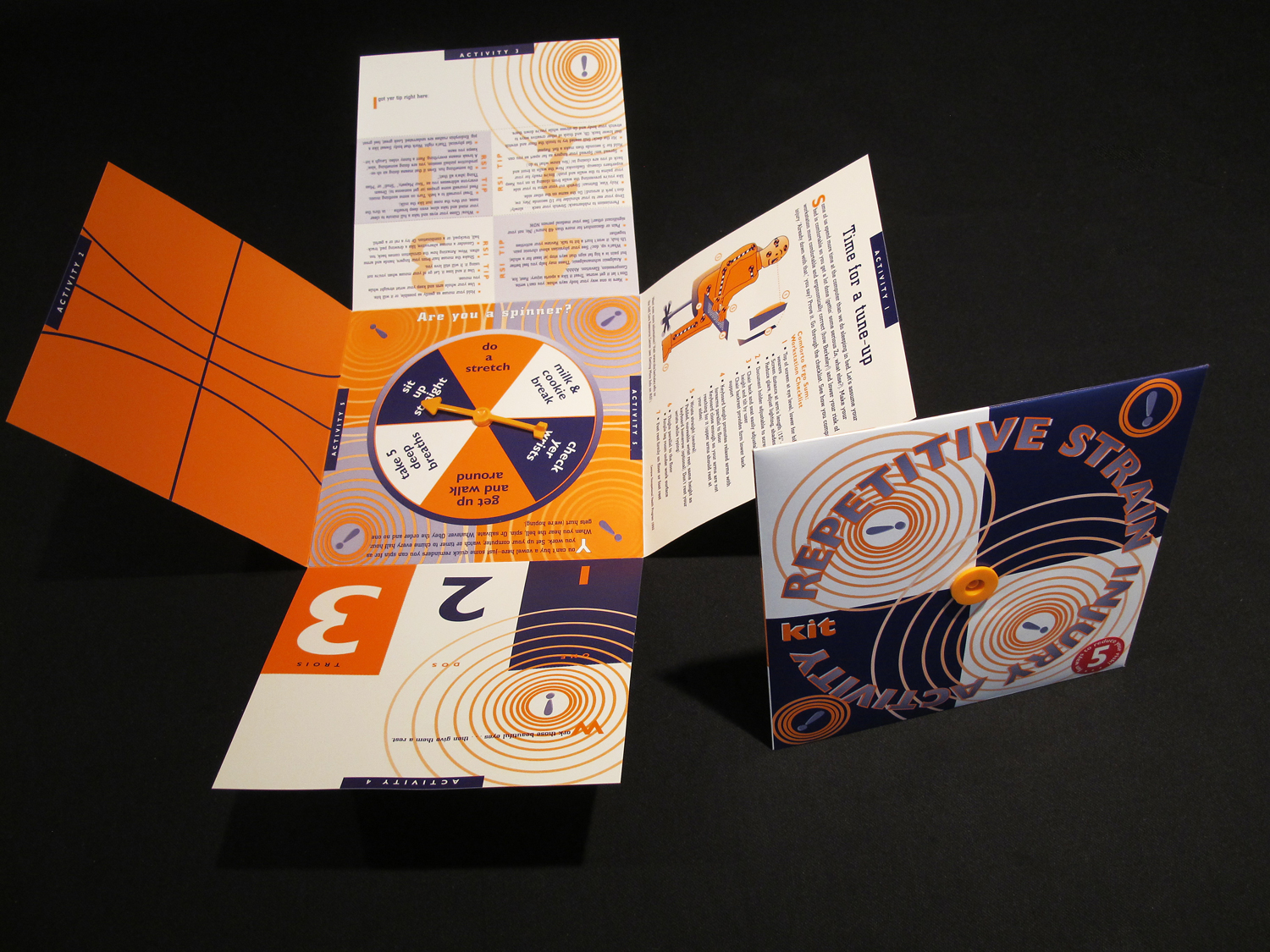
University Health Services, UC Berkeley
The university experience is ideally one that is an opportunity for growth—intellectually, physically, psychologically. The University Health Services at UC Berkeley support this with direct services and support to enhance mind, body, and soul. This project was produced thanks to a generous grant from the American College Health Association (ACHA).
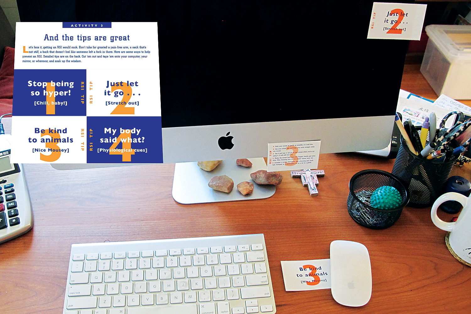
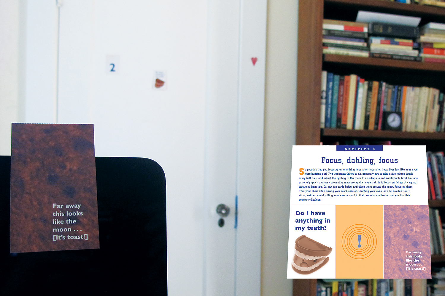
PROBLEM: According to a recent study, the Bureau of Labor Statistics reported that over half of all work injuries were related to repetitive strain injury (RSI). Carpal Tunnel Syndrome was a thing. Considering that computer usage among college students was no exception, there were no offerings to create awareness on this important health topic at the time.
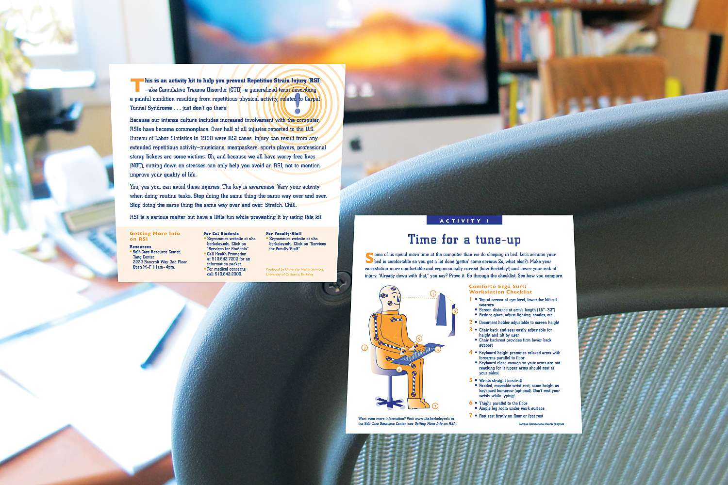
SOLUTION: To go above and beyond a typical (and boring) brochure with unintelligible facts, our team arrived at an RSI Activity Kit. We envisioned this set of 5 different activities as a fun, lasting approach to making our experience at the computer better in terms of our health.
CHALLENGE(S): Suggesting behavioral change to 18–21 year olds was assumed to be difficult in some cases, especially when it concerned an activity that one does for extended amounts of time, and often done not very mindfully. Students are already tasked with learning new things in their chosen subjects and may have little room for much else. The knowledge base for RSI was voluminous, often dry, and difficult to understand.
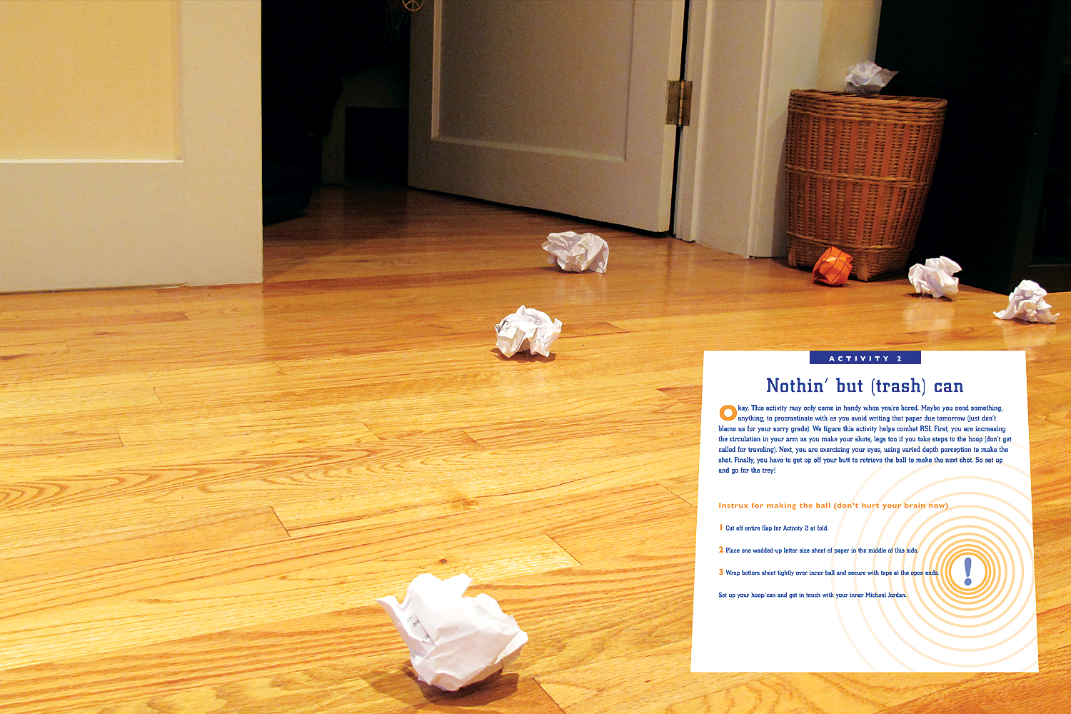
RESULTS: The cross-fold packet offered several opportunities for RSI awareness and prevention. Several binders of accumulated research and online resources were condensed down to the essentials. Language tone and messaging was set to casual, (National Lampoon?) with the assumption that by doing so it would feel more inviting, interesting, friendly. Usability studies were not extensive, though sufficient approval was gained from students and educators alike. Activity 1: set the stage with instructions on how to configure your station ergonomically. Activity 2: a silly way of taking a mental break, work on hand-eye coordination, and loosen up your wrist. Activity 3: various tips on the importance of down time, stretching, warning signs, when/how to get help. Activity 4: various cards to stick anywhere and decrease eye strain by changing your focal point from monitor distance. Activity 5: was inspired by my days as a board game developer, and the spinner not only changed the switched up how you were clicking madly on your mouse but made you just do something else for a second. I cannot take responsibility for those who gained weight because they rigged the spinner to always land on milk & cookie break. As for impact, had resources been available for creation of baselines, a longitudinal study could have provided more insight on the effectiveness of the approach.
PERSONAL ROLE(S): art direction, illustration, project management, sourcing and vendor relations, print management
> CASE STUDY 5 | STARTUP/PILOT PROJECT
comm.unity
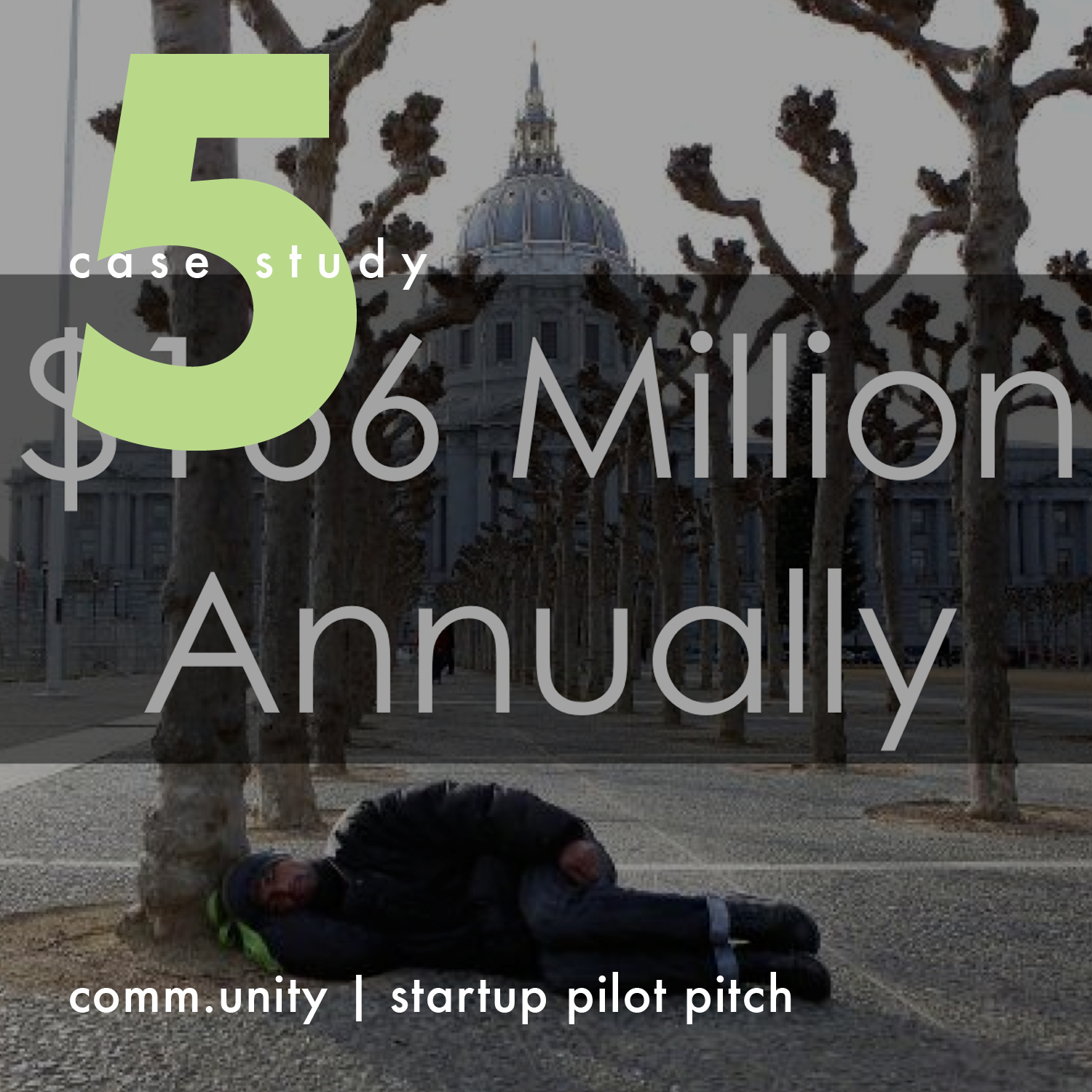
As our final requirement for the MBA program in Sustainable Management at Presidio Graduate School, our team produced a compelling business plan that showed a promising attack on an intractable problem. Our 5-month journey explored the opportunities to shake up the construct through technology.
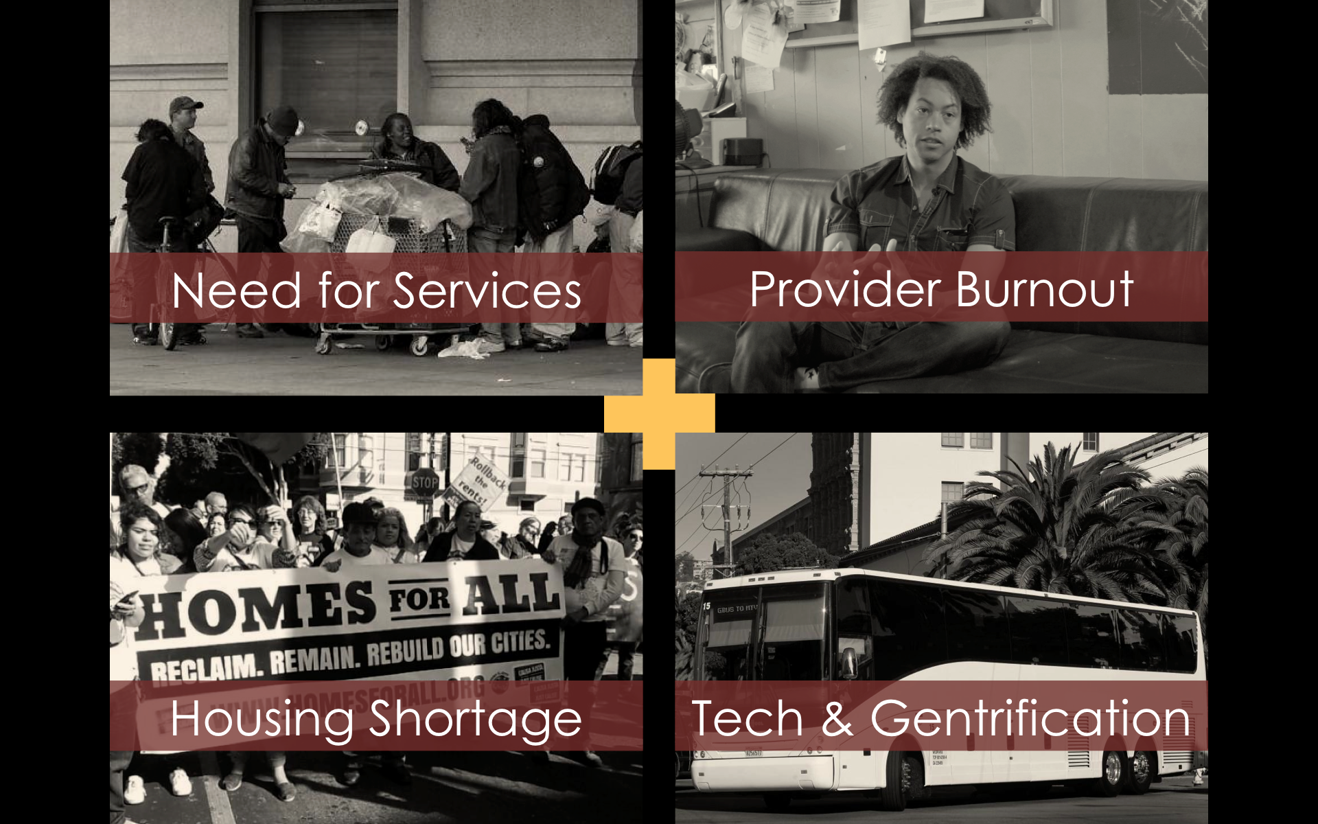
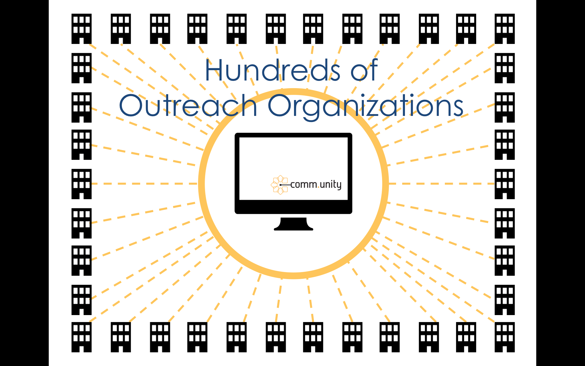
PROBLEM: The City of San Francisco spends $166 million annually in an effort to combat homelessness and support those experiencing it. Total homeless is roughly 7,300, or about 1% of the population, one of the largest per capita of major US cities. The City spends about $22,500/year/person in an attempt to better the lives of homeless people. Hundreds of homeless outreach organizations strive to maximize their impact, but they are disconnected from one another. A convergence of trends—such as the need to increase the impact of services for the city’s growing homeless population, the lack of communication between service providers and loss of institutional knowledge resulting from high worker turnover and burnout, the growth of the local tech industry and its association with gentrification, and the perennial housing shortage—present a dynamic opportunity for collaboration and innovation.
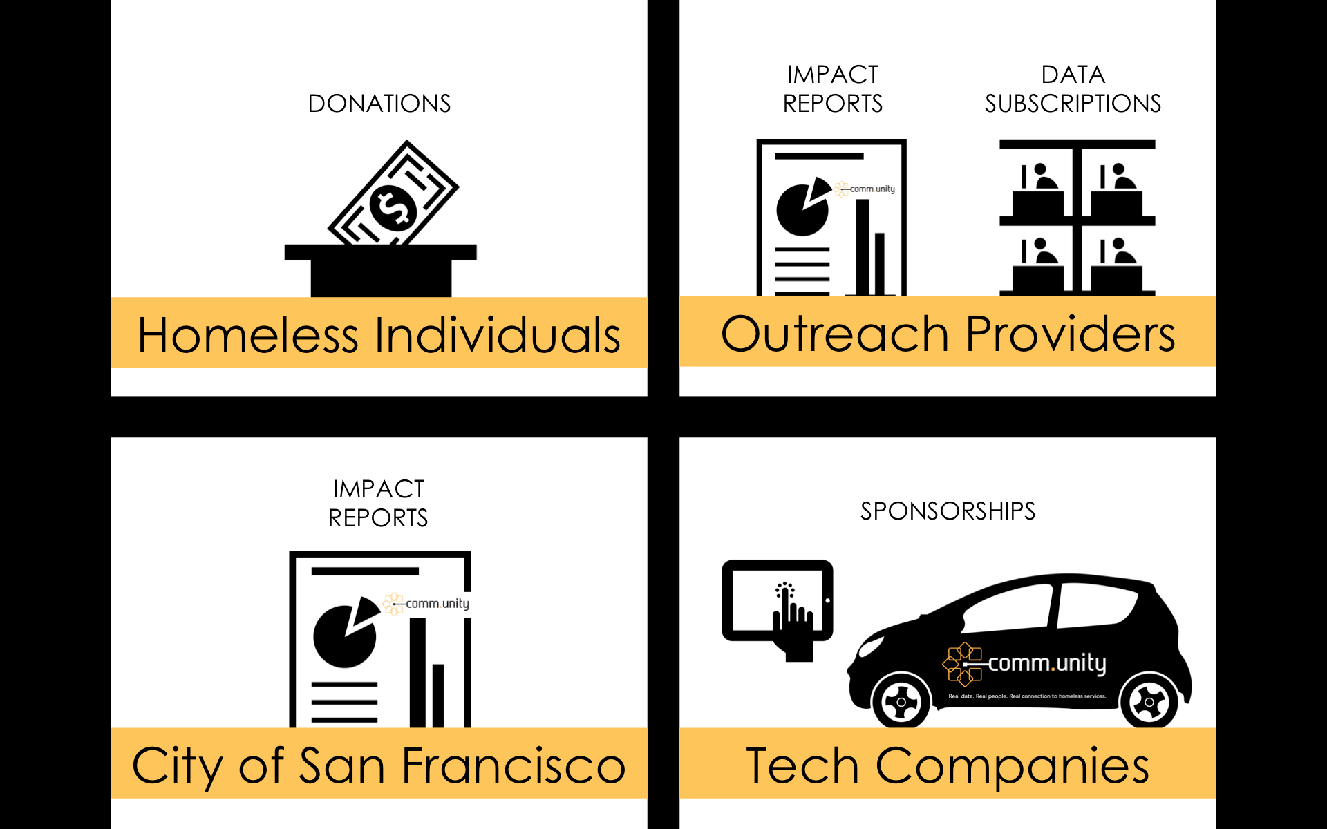
SOLUTION: comm.unity™ is a for-profit venture based in San Francisco that provides solutions to increase resource efficiency and information sharing among homeless organizations and the individuals they serve. By enhancing their efficiency and engagement, we enable provider organizations to spend more time and money and help those experiencing homelessness directly. Our offerings are an online portal of San Francisco-based, homeless outreach programs and organizations, as well as a corporate sponsored vehicle with WiFi hotspot capability that will transport street teams of partner outreach organizations into the field with tablet devices for portal access. Deliverables included a comprehensive business plan and supporting pitch video (see below).
CHALLENGE(S): The time frame we had to execute this project was extremely quick. Relationship building is crucial, especially when creating a social enterprise. While we did some user study activities, there was still room to do more but our resources and capacity were limited. As a result, proof of concept and model testing were not possible without initial funding for core construction of the network. One other major obstacle despite intent to launch in a tech industry-heavy area, is the extreme competition for housing and the friction that exists between real estate opportunities and social service.
RESULTS: A rigorous framework to test the viability of this venture was used: market studies (competitive, user), analysis, and strategy; operations plan and organizational design, revenue and financial models, risk analysis, and exit strategy. Our main targets for revenue centered around subscriptions to be used by agencies and sponsoring tech companies as a vehicle for philanthropy and public relations. The plan projected breakeven just before year 3, and we thought that since homelessness is no stranger to any big city, the need would be scalable. Initial build of the network would take a very concerted effort to audit and organize existing resources. Our team identified a great opportunity for public-private partnerships and/or social impact bonds to help achieve the goals of efficiency and human dignity. The team did not pursue further development of this project but is always open to sharing our findings should other partners wish to continue with the vision.
PERSONAL ROLE(S): marketing lead; financial modeling and projections; logo design, naming, and branding; video scene and storyboard crew
THE STORY: The logo was inspired by connection of agencies and a centralized vehicle by which to achieve it. Use of a modern typeface and a play on .com suggests the tech industry and digital modalities. The name also supports values the company stands for: com=tech; comm=communication; unity=connection.