> CASE STUDY 1 | IDENTITY SYSTEM
San Francisco School Volunteers
At the time of this project, San Francisco School Volunteers (SFSV) was the largest source of volunteers for San Francisco public schools. Each year they recruited and trained more than 1,400 volunteers for diverse roles in schools across the district. SFSV’s singular focus on serving the public schools made it an integral part of the city’s education system. 96% of teachers confirmed in a survey that SFSV volunteers enhanced their teaching, and students improved not only in academic skills but in self-esteem and confidence.
PROBLEM: The new Executive Director aimed to create a fresh, clean mark and take a 43 year-old organization to be more innovative. Strategically, the mark needed to be sophisticated and appeal to all, communicating care for school children of all ages and reframing the concept of “volunteers” with more of an entrepreneurial spirit. This new image would be a catalyst for showing forward thinking in the SF public school system. SFSV hoped to re-create itself as an incredible, powerful organization of community mobilization, leveraging resources to get the help and support the schools need. How could the new mark help to deliver on this vision?
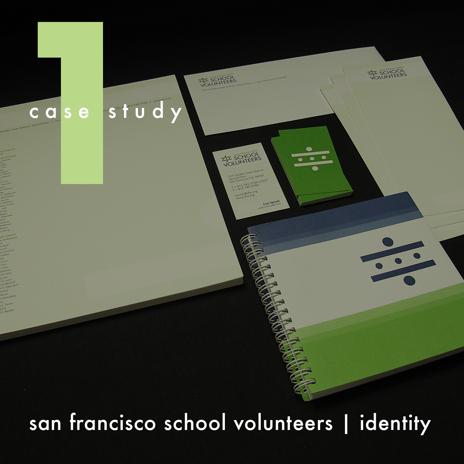
SOLUTION: The new mark system shows connection and collaboration in a bold and direct manner, conveying authority and competence. The logotype strongly communicates that the organization exists to build a volunteer network in a school setting, and could be adapted easily for other geographic designations should the model scale.
RESULTS: This pro bono service project for SFSV in collaboration with Taproot Foundation ended successfully, thanks in part to rigorous adherence to process. The discovery phase produced key insights based on historical background, informational interviews over a broad mix of constituencies, focus groups, perceptions and attitudes, and a competitive audit. Program value statements and quotes were recorded to help paint the current picture. Pain points about the branding included: inconsistency, passive marketing, unclear messaging, busy and unprofessional presentation. We identified core brand attributes to inform the mark: welcoming; committed; visionary; strategic; collaborative; inspirational; supportive; active in community. Exercises on positioning, value proposition, key messaging, and naming clarification all contributed to imagining and generating concepts, both literal and abstract. I collected various forms of visual research for inspiration. The sketches that emerged provided options to potentially develop into initial rough symbols. After some internal team discernment, 8 concepts were presented to the client. In my view, logos must work first in black only. 3 semifinalist concepts were developed further before 1 was picked as the final direction. Type and color studies rounded out the development. Our client was extremely satisfied and looked forward to seeing the new mark expressed fully in SFSV’s future branding and marketing efforts.

THE STORY: The new brand mark was conceptually inspired by a crosswalk, graphically representing the relationship between teacher and volunteer (larger dots) and the students they help (smaller dots). The bars of the crosswalk function as the outstretched arms of the adults, symbolizing the protection, care and commitment to school-age children and their quality of education. Additionally, the crosswalk itself resembles an equals sign: communicating equality, diversity, and balance in education; providing an opportunity to level the playing field of learning for all students; demonstrating the amount of responsibility and rewards of teacher and volunteer are virtually the same. The center dots also represent three aspects of the SFSV vision: movement and safe passage into the future; advancement and cultivation of ideas and vision; enhancement of the communities to which these students belong.
REFLECTION: Identity projects always mean change, so skillful leadership and organizational change management is required to facilitate adoption of new branding by long-term stakeholders. This was no exception. It’s important to make sure everyone is heard so that the organization can move forward by considering the input in the transition plan. In our rebranding, thought into how to capitalize on the brand’s existing equity was a crucial factor in our work.
PRIMARY ROLE(S): graphic design, print management